Kategorie: english

  • The most accessible font

    The most accessible font

    This article is not scientific in any way. I try to learn about accessibility for some time now and can just put my aggregated knowledge and my thoughts in here. So please feel free to criticise and correct me where I’m wrong. I will be sharing about accessible font myths, the audience and the actual letters in this article.

    Disney Logo

    „GiSNEp“ is what a lot of people read here. But more about letter recognition later 🙂

    The first pillar of sustainability is „people“. We can do a lot of things in ways of saving the environment but never without forgetting that people and therefore accessibility should always be considered first priority. So when we try to find a new font for our company, website, project or whatever we should make sure people are happy with it. This helps everyone.

    When creating a brand design choosing the font we use for copy and headlines usually comes right after the logo design and the colours because it needs to look good in context. I will not be talking about headlines in this article as they of course can’t be neglected when designing, but they don’t need to be as legible and accessible as regular informative text in the copy. Headlines should of course be legible aswell, it’s just that the bigger size of them helps reading a lot. We’re talking about copy text here though.

    Myths & audience

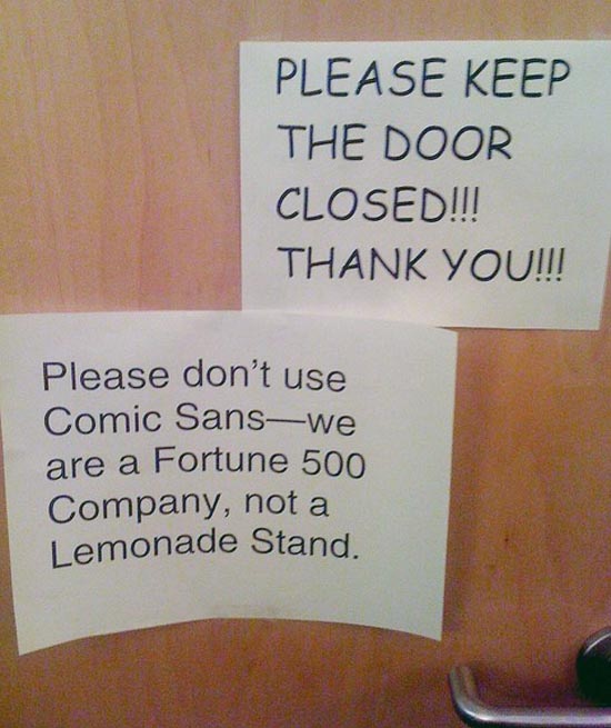
    The commonly distributed myth is that Comic Sans is the most accessible font made for dyslexic people. And no surprise – it is in a way. It was created for young pupils though that just started to learn reading and writing so it resembles the things they learn early. And often times they learn the letters like this and might even read comics where the font resembles Comic Sans. And for that audience it does work well, because that’s all they know. For older audiences though we have to consider the following.

    There even is a font made specifically for dyslexic people „Dislexie“, but not all dyslexic people agree that this helps them. All people are different.

    Lexend“ and „InclusiveSans“ are examples of fonts made especially for readability and therefore also for accessibility. But more on how to achieve this later.

    Printed out in Comic Sans: Please keep the door closed!!! Thank you!!!
Another printout underneath:
Pleas don't use Comic Sans - we are a Fortune 500 Company, not a lemonade stand.

    All people

    This is of course an impossible task/audience because there will always be individuals that can read this or that font better than any other. Even personal preferences can lead to this. Font preferences are far away from a reading deficiency though, and good readability helps everyone (as do most accessibility improvements).

    People with poor vision

    When dealing with poor vision there is lots of ways we can help people read. A good font is one of them. We’ll learn more later.

    Learning disability

    Learning disabilities can vary very much. So here we should try to provide individual solutions.

    Aphasia or dyslexia

    These conditions both lead to make reading more difficult and we can address those difficulties by choosing a font that tries to eradicate all the little problems that arise with letters.

    Example

    For people to better understand what dyslexia is like, Daniel Britton designed a typeface that recreates the feeling of reading with dyslexia. You can see the full version of his work here:
    https://danielbritton.info/dyslexia/

    Checking the site today I can see that the images for the videos aren’t loaded. But you can see the videos by clicking on the images.

    text with broken type that leads to very slow reading and much guesswork

    The Chrome-Browser extension „Silktide Accessibility Checker“ has a dislexia simulator which is worth a try. You will see a lot of jumping and swapped letters. Check it out.

    What makes a font readable

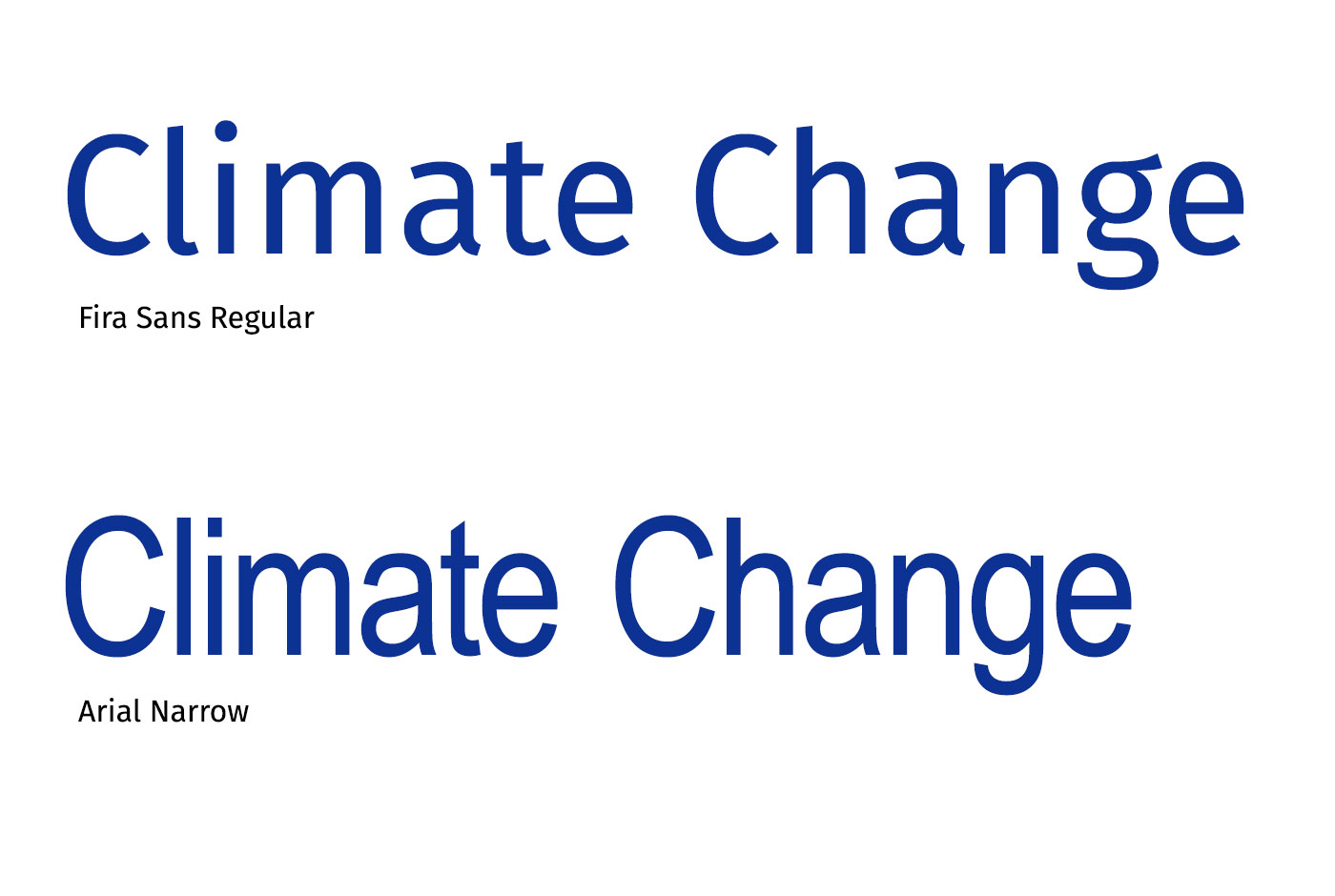
    Aside from the contrast that the font needs to have against the background it is on, it’s important that the letters can be identified and distinguished from each other easily. The letters need to be open and not crammed so when seen in small, in bad light or blurry they can be identified. Line thickness should be visually consistent and not too thin because of the same reasons. The Disney logo font above does most of this wrong. Here’s another example:

    The words

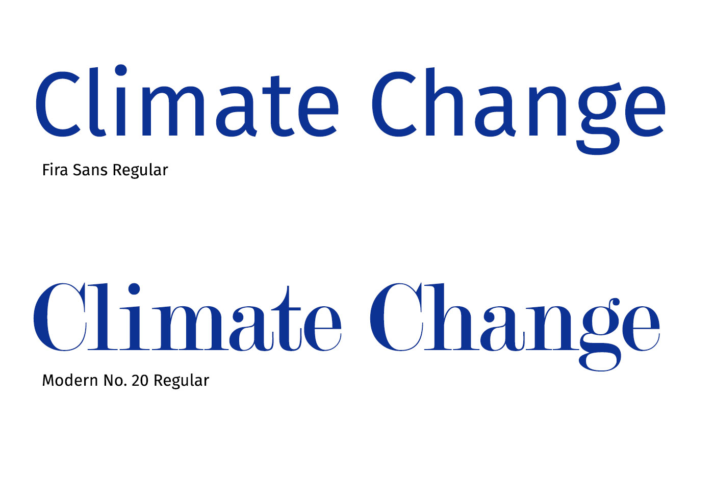
    You can see that the „C“ and „e“ in Modern No. 20 are almost closed and the thin lines don’t help at all when it gets blurry or small. Close your eyes a little, then you know.

    Text size is of course important here aswell, because when the letters are huge you won’t have that many problems with that. So make sure your text is big enough to read. 18px rendered size for copy text is considered good. Keep in mind that people will try to enlarge text with Ctrl + on Windows or Command + on OSX in browsers, and make sure that works properly.

    Openess and condensed

    Letters CO e o c a in font Noto Sans and in Font Arial

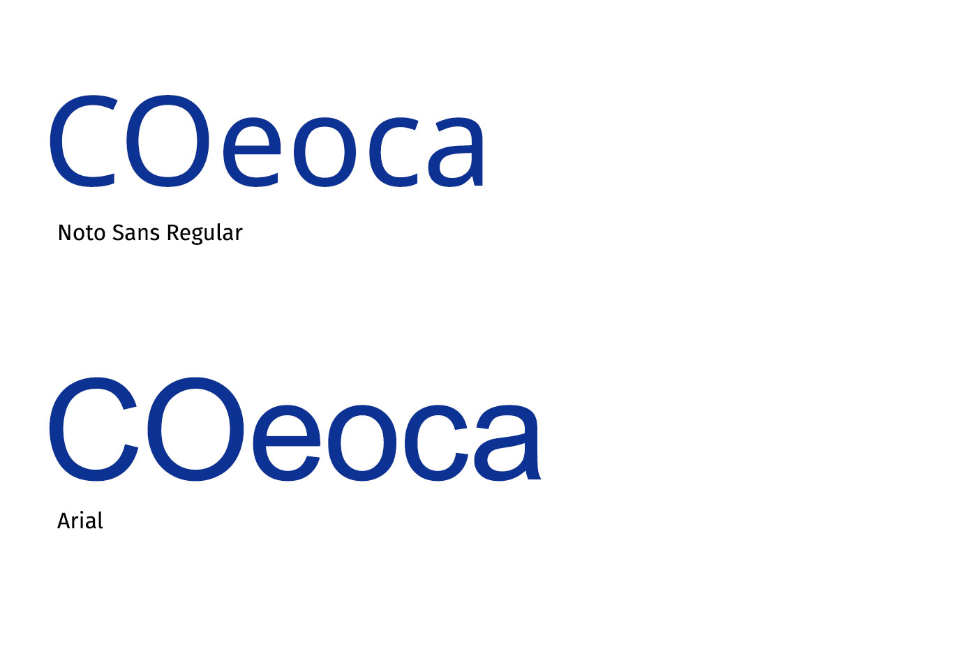
    It’s no surprise really that this almost looks like a test at the optician where you have to say in which direction the circle opens. And exactly that is what you need letters to be open for. When it gets blurry or you have low contrast, small letters etc. it’s really helpful for identifying letters.

    Climate change written in Fira Sans Reguar and in Arial Narrow.

    As you can see in this example narrow or condensed fonts don’t help with the openness to distinguish letters from each other. The almost closed „C“ and „e“ don’t help either. Same goes of course for letter spacing. If you don’t have enough space in between letters, that will lessen readability.

    Distinguishing letters

    The letters themselves should be easily distinguished from each other. A good test to see if a font is good at this is the big i small L and 1 test aswell as the bdqp test. Don’t end up with imposter letter syndrome!

    The letters in font BBC Reith and in font Gill Sans

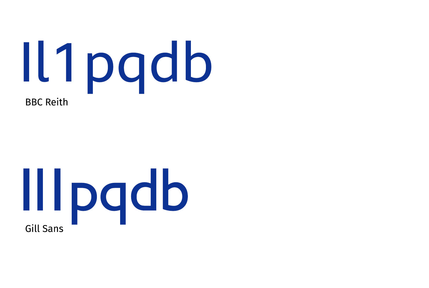
    As you can see in Gill Sans you can’t differentiate at all between I, l and 1. That works far better in BBC Reith which was designed for readability by the BBC and is used throughout their whole design. The p q d b test pretty much means: „When I mirror the letter, will it look the same?“ and BBC Reith is very good at this but surprisingly ye olde Gill Sans doesn’t fail it either with the d and b. This is by the way why some people will read the „D“ in the Disney logo as a „G“. It’s a mirrored „G“.

    Here’s a list of imposter letter:

    • qp
    • db
    • 0O
    • nu
    • il1I
    • 69
    • a8
    • a6
    • 6g
    • rn, m

    So what’s the solution Phillip?!??

    As you can see there aren’t that many things you have to look at when searching for a font for your copy text. Just do these tests and look if your font is good for readability. In Google Fonts or any font software you can choose your own preview text. Try it out!

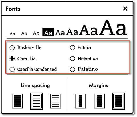
    If you want to help lots and lots of people you could even let them choose their own font, like the Kindle does.

    Font chooser where you can choose the font, text size, line spacing and margins.

    If marketing won’t like this one because they want their design to be consistent, make them choose an accessibility-friendly font for copy text when the next design iteration is due. Lots of good fonts available, like this is written in Atkinson Hyperlegible for example.

    There’s many other things you can do to help readability like reduced highlighting, small line length, no justification with wonky spaces in between words, good line spacing, varying layouts broken up by subheadings to keep the reader animated and help digest the input, white space to give eyes a place to rest etc. etc. But these are the basics for choosing a font.

    Last but not least…

    By the way - this is an example of a display font made for “Display” meaning big letters in the shopping window, big headings for advertising and such. It hasn’t been made or intended to be for copy text at all. So if a font is labled “display” you can ignore this one for copy text.

    Thank you for sharing the article and sharing your thoughts!

  • The madness that is WordCamp Europe

    The madness that is WordCamp Europe

    I have been part of the WordCamp Europe team for 4 years now. It’s time to take a small look back to the event this year and see where we are. I started with joining the communications team back in Vienna in 2016 right at the beginning of the event. It was my first experience and the first visit to a WordCamp Europe. Everything was huge and awesome and I was star-struck by all the WordPress-celebs that were there. I continued my journey with being an organiser on the comms and design team the next 3 years.

    cooking a nice meal versus professional business meeting lunch with a regulator slider in the middle

    WordCamp Europe is the biggest WordPress event in the world and is the go to place if you want to learn, contribute and connect with the european community. As cool as local meetups throughout the year are and local WordCamps can give you lots of opportunities, WordCamp Europe is the place to be.

    There are of course some deniers, thinking that the community and their events are not needed in any way and the codebase is all you need to be successful within the WordPress realm. I know a couple. They are also the people complaining about everything like they would with a Microsoft product or something they bought and doesn’t do what they hoped for. I’m not questioning the existence or the need for the event. When 2743 people show up, you know there is a need. And yes you can complain, and please do when something is not right or you have better ideas for the event. And if you really want to be part of the change join.

    Click here to display content from Twitter.
    Erfahre mehr in der Datenschutzerklärung von X.

    WordCamp Europe is a huge event and really has not much to do with a small local WordCamp anymore with 200 people. Yes the food is still very important and the complaints about that are always fun to follow, but the scale on the organisational side is insane.

    The event costs 800.000€ these days. Visitors pay 50€ for a Contributor Day with food, 2 days of talks, workshops, discussions, wellness and food and then you get a whole party with food and entertainment. The biggest amount of the money comes from sponsors.

    And this is where it gets complicated. Is that all needed? Do we need 200 volunteers? Can we spend the money for better content? Should we have more workshops? Can we spend it for better food? Can we spend it for more content? Can we spend it for a second Contributor Day? Is it all sustainable? Is it all welcoming, accessible, family-friendly, tolerant?

    Click here to display content from Twitter.
    Erfahre mehr in der Datenschutzerklärung von X.

    The event has grown over the years and each organiser team brings new things to the table each year. Everybody is very enthusiastic and hard working throughout the year to make new improvements possible. But in my opinion it’s grown in places it doesn’t need to grow and fell short in other places that needed more attention or maintenance. The visa process, the gender balance in the team, the always fun food fights, the tons of produced trash are all examples where there is still lots of work to do and to grow in the right direction. The team was and is still working on those with amazing progress, but we’re not where we should be.

    From several sides I heard the pleads and arguments that some areas of the event need to be professionalised, that the organiser team should be smaller, that most of the volunteer work could be done by the venue with much less work on the organising side. This is the challenge that the new team has now.

    Lead organisers are exhausted because of the scale of the event and work so much that they’re neglecting their businesses hence loosing money. Or if they work for a company they have to think in terms of will my job/position still be there after the 10 months I worked for WordCamp Europe or will somebody else be doing it? And that even happens when they are fully sponsored by a company! It’s loosing position, money and not to forget lots of free-time and strain on their families. I as a team-member did 4 to 5 hours every week the last year and even that is sometimes hard to maintain with paying customers calling and demanding problem solving, incidents in the family etc.. People leave teams on a regular basis during the year, every year for diverse reasons. But that’s okay, life happens, people might not fit together, expectations were different. It’s a new start-up every year after all. Things happen.

    Let’s not forget though what a great event it was this year and the amazing job the team did. Everybody worked so hard and I must say that a lot of good things were simply sabotaged by the venue’s inability to adapt. Food, show, logistics, even our design signage was very hard to organise with the venue. We are of course not the regular convention customer, but they should have known that after the first meeting. And yes the team can always do better. So don’t hesitate to give them your feedback, good or bad, it’s all needed.

    Click here to display content from Twitter.
    Erfahre mehr in der Datenschutzerklärung von X.

    The future will show where it goes, will it be all businessy professional with keeping 200 volunteers from having a great networking and learning opportunity? Will it solve problems of people not feeling save? Will it be more friendly for contributors or more lucrative for businesses? Will there be vegan and omnivore seperated lunches (I hope not)?

    I love the new leading team as I have seen them in action throughout the year, but I need a break. Maybe next time ? And if you want to learn how a huge event is organised and work on it in a pretty save and open environment and see it all come together in vibrant Portugal — they’re great people. Join.

    And thank you design team. What a great year, love you all   ?

    Click here to display content from Twitter.
    Erfahre mehr in der Datenschutzerklärung von X.